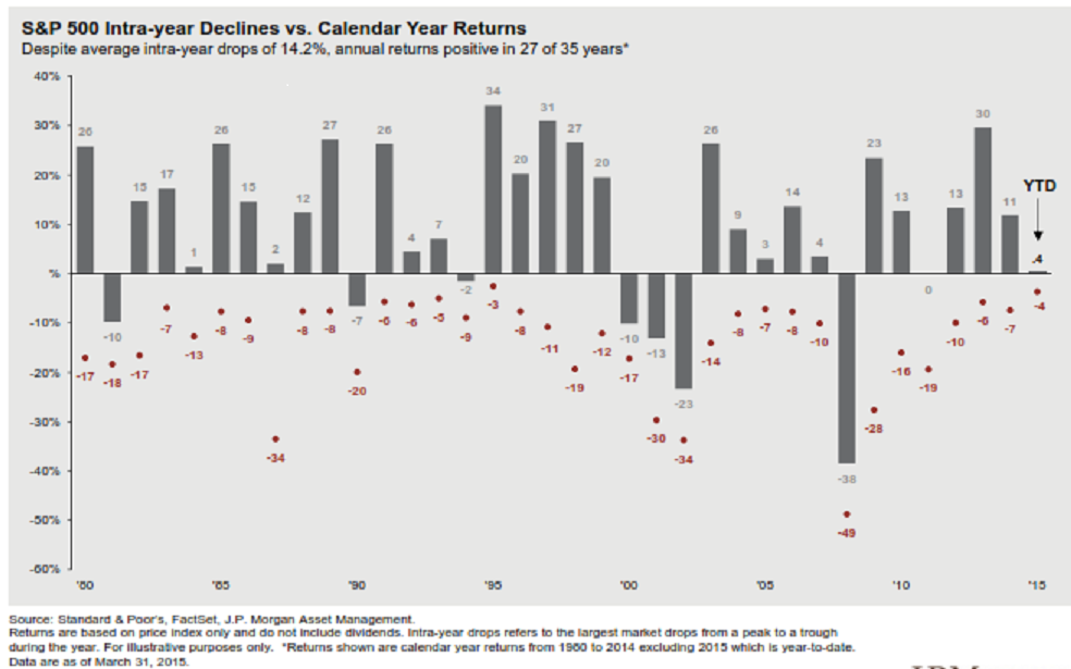
Here is a chart that I found (SEE BELOW) that I found pretty interesting.
It shows the S&P 500 returns over the last 35 years. 27 of those 35 years were positive. But the average intra-year drop in value was -14.2%. In other words, even though most years have gains, the average loss within those years was in double-digits.
Of course, some years had bigger drops and some had smaller drops within the calendar year.
But to me, the most interesting thing that the chart shows is the losses (shown by the RED dots and the loss -% next to it) during even the big UP years.
For example, in 2012 there was a 10% loss during the year that ended up 13%. In 2011, the S&P 500 was flat, but the loss (we call it drawdown) during the year was -19%.
So yes, during most years the market goes higher, but for retirees taking an income stream from stocks and mutual funds, those losses during the year can hurt – as you need to sell more shares for the same income.
That is why protecting capital is more important than just buy, hold (and pray) when taking distributions from your retirement savings.
all the best… Mark