If you have a portfolio, you might find this message and the accompanying chart (SEE BELOW to view) interesting.
Yes, the S&P 500 has made a number of new all-time highs in recent weeks and has earned 11.27% year to date (YTD)
But most folks don’t invest ONLY in the S&P 500.
They also invest in various types of bonds, small US stocks, international stocks, commodities (gold, oil, etc.) and so on for a diversified portfolio.
I’ve attached an image YTD comparison of various index returns that I made from Yahoo Finance that shows how most parts of investor portfolios (as measured by various indexes) are not doing nearly as well as the S&P 500 this year.
Of course, that relative performance always changes over time.
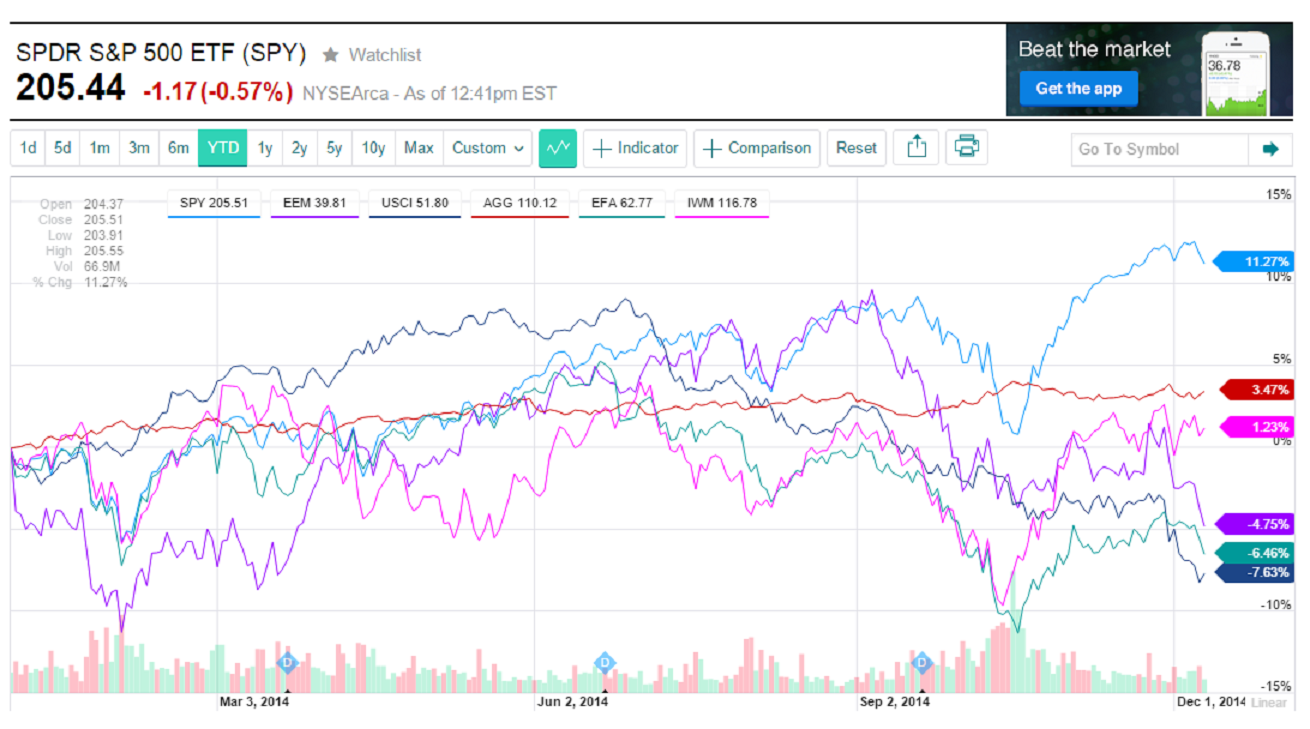
As of 12/9/14 at 12:40 pm the photo shows how some of the indexes compare to the S&P and how most investors with a real-life diversified portfolio aren’t seeing anything close to double-digit gains.
The image of the YDT chart shows the S&P 500 in light blue with a +11.27% gain. The US bond index is maroon and shows a +3.47% gain.
The Russell 2000 (US Small Cap company index) is in pink with a +1.23% gain for the year so far. The Emerging Market index (China, Brazil, India, S. Korea, etc.) in purple shows a LOSS of -4.75%.
The International Large Cap stock index also shows a loss (-6.46%) and the Commodity Index shows a loss of -7.63%.
The point of the chart is that if you are like most investors with a portfolio that’s diversified you’ve likely experienced a mid single digit gain or maybe even a break-even for your portfolio in 2014.
Just food for thought and some perspective to the “hype”.
all the best… Mark