I’ve taken this “slide” from my new workshop based on my newest book (I hope to record it and put it on the website someday soon). I hope that you find it very educational.
You probably know that over the long haul, the stock market has experienced average double digits gains, but most of us don’t retire for 60-100 years. Most of us are only retired for about 30 years.
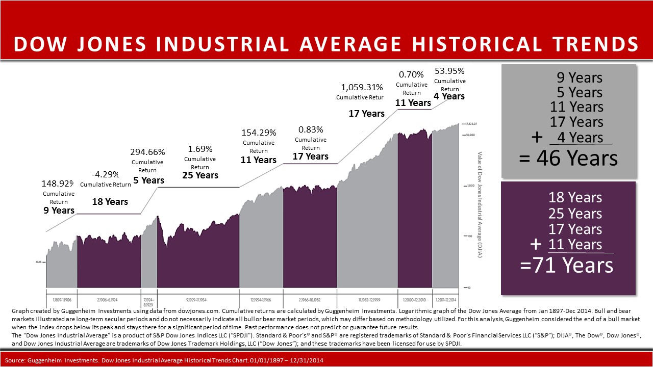
Going back over 117 years you see what are called secular bull and bear markets that are shown in the different colored bands. These are long periods of either big up-trends or sideways markets. There have been nine of these long-term secular trending markets.
The gray areas (5 of them) are when the markets have gone up and when investors have seen ALL of the historical gains. The purple areas are long periods (4 of them) when the market had basically done nothing, like the 25 year long period after the depression. During those two and a half decades, the market only gained a cumulative 1.69% – that’s a TOTAL gain – NOT an annualized gain.
And look at the nearly 0% cumulative gains during the 17 years ending in 1982 or the 11 years ending in 2010.
Of course you have the 17 year period ending in 1999 when the stock market had the greatest and longest bull market ever. Up over 1059%. FYI – this is the period when the flawed 4% withdrawal “rule” was started for retirement income purposes. That “theory” suggested that one could take a 4% initial withdrawal rate from their total savings in their first year of retirement and increase that amount by inflation every year and they would have a 90% probability of their savings lasting for 30 years.
Another thing you may notice is that the gray area (the good years) has only lasted a total of 46 years while the flat markets have lasted 71 years.
Let me ask you a quick question. Based on what you are looking at, what would be the best time to begin your retirement (as if we really have a big choice — lol)? In a gray area or a purple area? I certainly wouldn’t have wanted to begin my retirement in 1930, 1966 or 2000.
Although the chart stops at the end of 2014, if you add the S&P 500 gains for 2015 and up through 9/02/2016 you would only add 8.5% to the 53.95% shown. That equals a total cumulative gain in this period of 62.5%.
Any guesses how long this purple area will last and how much the cumulative gain will before we enter the next gray area??
I don’t know, but the markets continue to move near the all-time highs. If nothing else, this chart should give most everyone some food for thought.
all the best… Mark
PS — If you’d like to get my newest book at Amazon, please go to: www.MarksNewBook.com