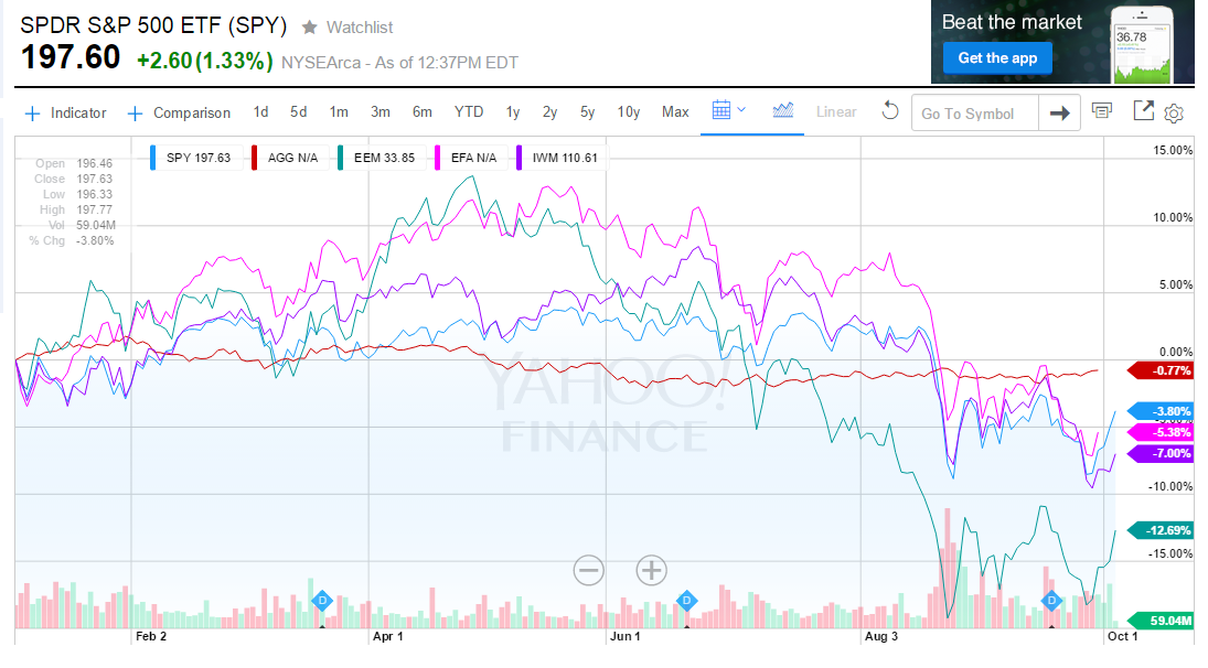
Below you will see a year-to-date chart of some of the major market indexes for 2015. As you can see, in most of the asset classes there has been a pretty high amount of volatility – especially since June or so.
Here are the asset classes shown:
Blue – SPY – the S&P 500
Red – AGG – the Barclay’s Aggregate Bond Index
Aqua – EEM – the Emerging Market Index (stocks – India, Brazil, Russia,
China, etc.)
Pink – EFA – the Developed Foreign Stock market index (UK, Germany,
France, Japan, etc.)
Purple – IWM – the Russell 2000 (US small cap stocks)
You will notice not one of the above indexes is positive for the year so far. The best performer is the Barclay’s Bond index which is down only -0.83%.
If I added a line of the US 10 year Treasury you would see tremendous swings in the price of the bond with the fluctuations of interest rates. In fact the value of that 10 year bond has gone up,,, and down by 10% or so within just a few week a couple of time in 2015. That is huge movements in one of the “safest” investments in the world. Yes you get all of your money back in 10 years but the value of the bonds can be much higher or lower depending upon what’s going on with interest rates.
The unusual volatility in all stocks that we’ve seen over the year comes from a number of sources. For one thing, there is a battle between the bulls and bears over the length of the market rise since its lows in March 2009. We are in the 7th year of a potential “up” market – if the market reverses course and ends up positive.
Other forces pushing and pulling the markets are the US dollar, oil prices, China, suspect earnings growth in the US,
Most of the stocks in the S&P 500 are down by up to about 15-20% in 2015 but the index is only off -3.38%. How can this be?
Because that index is “market cap” weighted so the biggest companies count the most. The top 10 largest companies count for some 17% of the index while the other 490 stocks only count towards the 83% balance. The smallest 100 stocks in the index barely move the needle.
You can see that the worst performing index is the EEM (emerging market stocks) – down 12.69%. Most of these economies are commodities based and with oil, copper and so many other commodities trading badly, these markets have been rocked.
Of course, the big question is what is going to happen through the end of the year?
You already know that it’s anyone’s guess. But if a gun was held to my head, I
would imagine we are in for another drop towards or even a bit below the lows of August (see chart) but then we rebound and end up slightly positive for 2015 (at least on the S&P 500).
all the best… Mark